Plot Testing Specification
Single Curve
# |
Setup |
Execution |
Expectation |
|---|---|---|---|
1 |
Create a developer project. |
Select the button “Single Curve” in the Debug Tab. |
|
1.1 |
Change curve properties (line style, thickness, colour). |
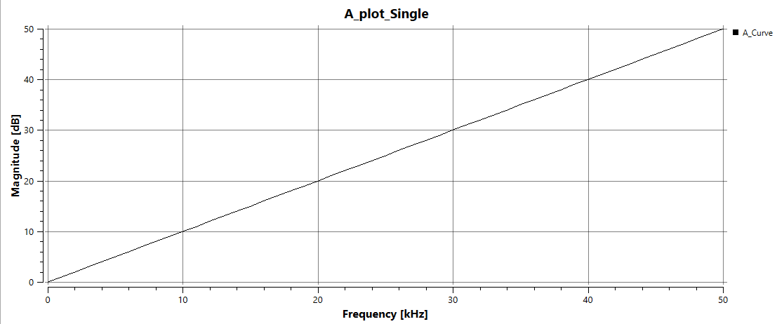
Curve updates with new settings. Process should be quick (UI should not re-query data). |
|
1.2 |
Close and reopen the plot view. |
Updated curve properties persist. |
|
1.3 |
Rename the curve entity. |
Curve title updates to the new entity name. |
|
1.4 |
Rename the plot entity. |
Plot title updates to the new entity name. |
|
1.5 |
|
Curve is not plotted for values ≥ 30. Zooming out confirms data are truly filtered, not just zoomed. |
|
1.6 |
|
Only frequencies from 10 to 20 are plotted. |
|
1.7 |
Disable Autoscale in Y axis group. Set min = 10, max = 15. |
Only the section of the curve from 10 to 15 is shown. |
—
Two Curves
# |
Setup |
Execution |
Expectation |
|---|---|---|---|
2 |
Select the button “Two Curves” in the Debug Tab. |
|
|
2.1 |
Select the entity A_Curve1. |
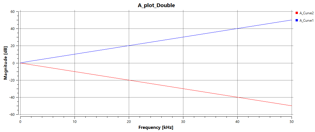
A_Curve1 is shown in its selected colour; A_Curve2 is grayed out. |
|
2.2 |
Select the entity A_Curve2. |
A_Curve2 is shown in its selected colour; A_Curve1 is grayed out. |
|
2.3 |
Select the plot entity A_plot_Double. |
Both curves are shown in their selected colours. |
Family of Curves
# |
Setup |
Execution |
Expectation |
|---|---|---|---|
3 |
Select the button “Family of Curves” in the Debug Tab. |
|
|
3.1 |
Change colour setting to Fill and choose a colour. |
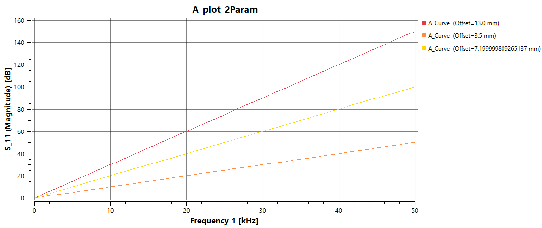
All three curves appear in the chosen colour. |
|
3.2 |
Close and reopen the plot view. |
Curves retain the chosen colour. |
|
3.3 |
Set colour setting to Style Reference and choose Rainbow 0. |
Each curve appears in a different colour. |
—
Family of Curves with Third, Constant Parameter
# |
Setup |
Execution |
Expectation |
|---|---|---|---|
4 |
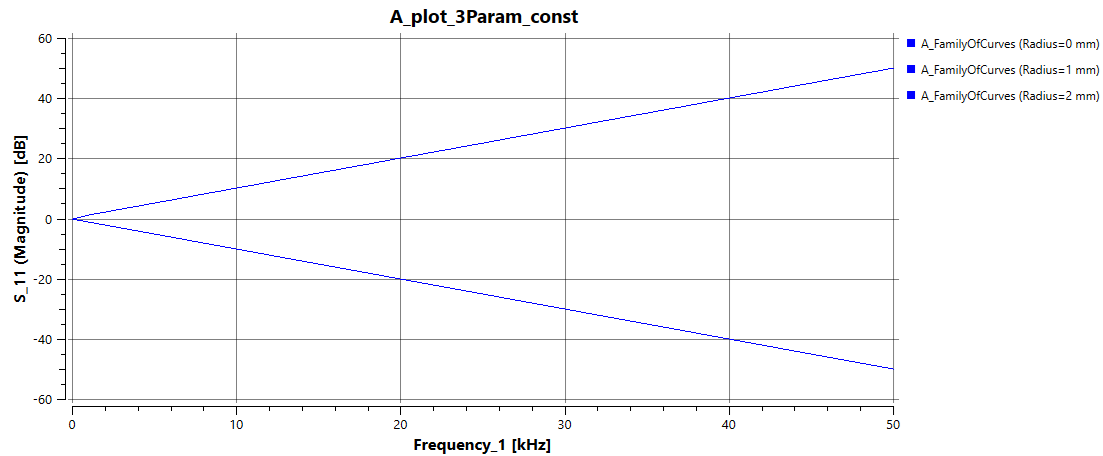
Select the button “Family of Curves 3P const”. |
|
|
4.1 |
Change the name of the curve entity. |
In the curve titles, only the entity name changes, the brackets remain |
—
Family of Curves with Third Parameter
# |
Setup |
Execution |
Expectation |
|---|---|---|---|
5 |
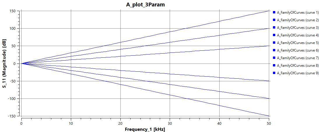
In the Debug Tab, select the button “Family of Curves 3P” |
|
|
5.1 |
Change the name of the curve entity. |
In the curve titles, only the entity name changes, the brackets remain |
—
Scatter
# |
Setup |
Execution |
Expectation |
|---|---|---|---|
6 |
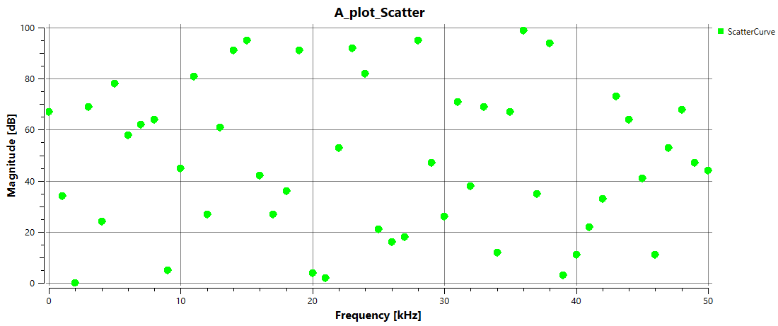
In the Debug Tab, select the button “Scatter Plot” |
A plot is created in Test folder. Plot looks like image. |
—
Single Dot
# |
Setup |
Execution |
Expectation |
|---|---|---|---|
7 |
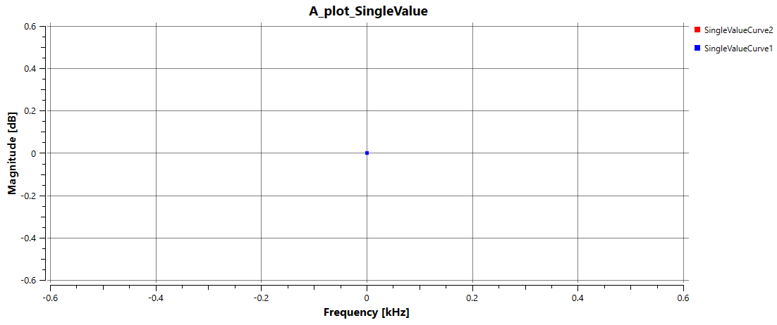
In the Debug Tab, select the button “Single value plot” |
The plot should show only a single dot. Plot looks like image. |
|
7.1 |
Select the SingleValueCurve2 entity |
The red dot is now shown in the colour of the SingleValueCurve2 curve. |
—
Matrix and Manual Plot Creation
# |
Setup |
Execution |
Expectation |
|---|---|---|---|
8 |
Import the Touchstone file CMC_Stysc |
In the Dataset folder, select the CMC_Stysc entity and execute the “Create Plot” button in the “Model” tab |
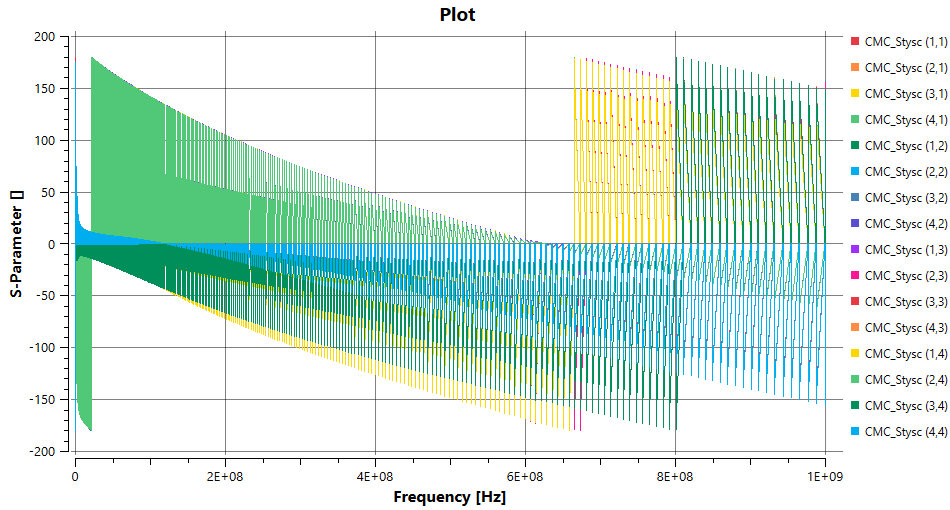
In the folder Plots, a new plot appears, that looks like the image. The curve names consist of the entity name and have matrix indices in the chape of (x,y) behind |
8.1 |
In the plot entity settings, deselect the property “show entire matrix” |
Only one curve is now displayed |
|
8.2 |
change the Show matrix column/row property values in the plot entity |
Different curves are shown |
|
8.3 |
Select the plot entity of Single Curve and the Dataset entity of the Scatter plot. Execute the button “Add curve to plot” in the model tab |
Another curve entity is added below the plot entity of the Single Curve. Both curves are now displayed in the same view. |
